


Choropleth maps are essential for visualizing data across geographic regions, using shading or coloring to represent different values. Commonly used in demographics, economics, public health , these maps make complex data easily understandable. Understanding what a choropleth map is and how it works is crucial for anyone involved in data visualization.
In this article, we will explore what a choropleth map is, providing a clear definition and examples. We will guide you on creating choropleth maps using the Datawrapper user-friendly tool for quick and easy map creation. For those seeking more customization, we'll demonstrate how to create a custom choropleth map using JavaScript, leveraging Geoapify's Boundary API and Geocoding API to fetch geographic boundary data and convert addresses into coordinates.
By the end of this article, you will have a comprehensive understanding of choropleth maps and the skills to create your own custom maps tailored to your specific needs.
On this page
Choropleth Maps Definition
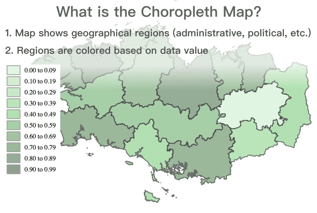
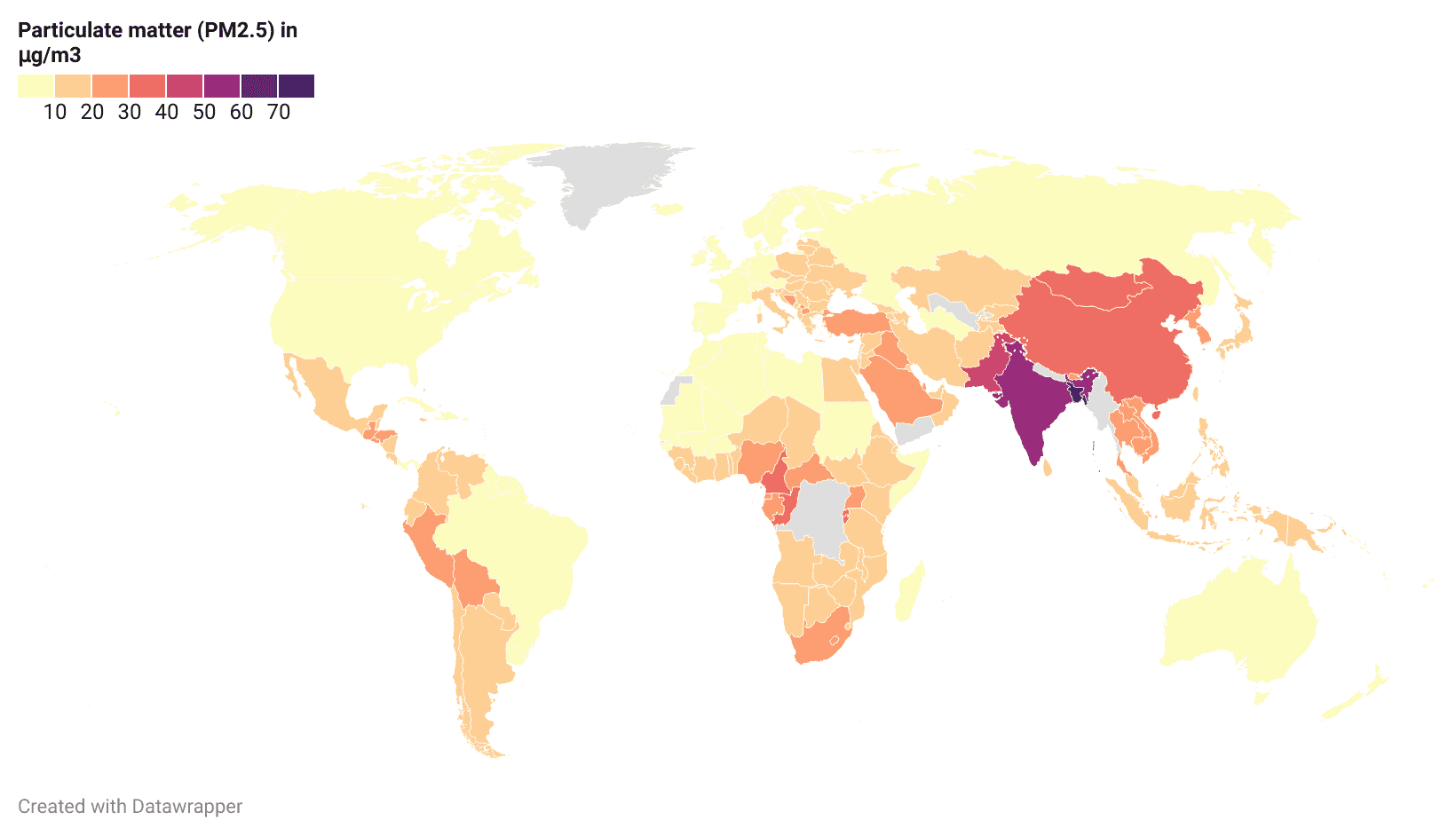
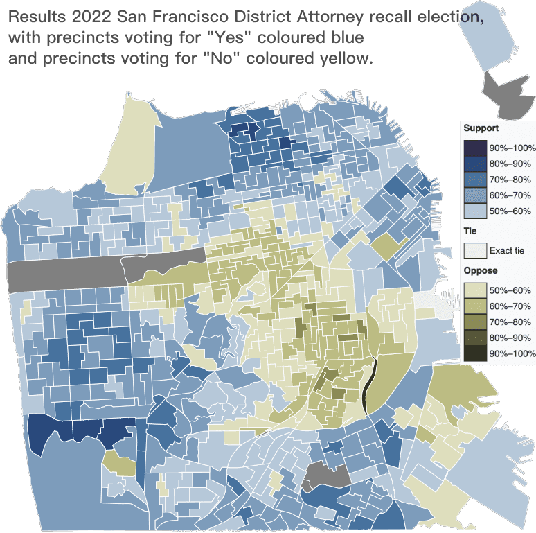
A choropleth map (from Ancient Greek χῶρος (khôros) meaning 'area, region' and πλῆθος (plêthos) meaning 'multitude') is a type of thematic map used to represent data through shading or coloring of predefined geographic areas. Each area is shaded or colored in proportion to the value of the variable being represented, making it easy to visualize spatial distributions and patterns.
Key Features of a Choropleth Map
- Geographic Boundaries: The map is divided into distinct geographic regions, such as political boundaries or natural divisions.
- Data Representation: Each region (e.g., states, counties, countries) is colored based on data values.
- Color Gradient: Typically, a gradient of colors is used, where darker shades indicate higher values and lighter shades indicate lower values.
The Importance of Choropleth Maps
Choropleth maps are powerful tools for data visualization because they allow viewers to quickly grasp patterns and trends within a dataset. By using different shades or colors to represent varying data values, these maps can effectively highlight differences and similarities across regions. This makes it easier to compare data geographically and identify areas of interest or concern.
Examples of Data Represented Using Choropleth Maps
Choropleth maps can be used to visualize a wide variety of data types, including:
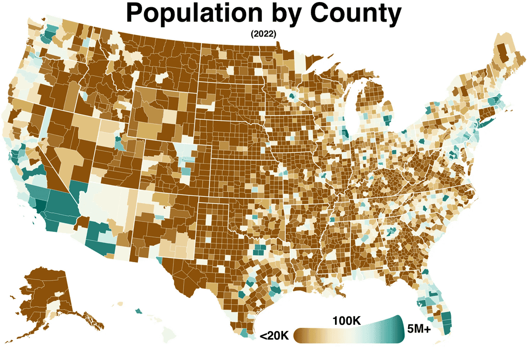
Demographic Data
Choropleth maps effectively visualize demographic data such as population density, age distribution, and ethnic composition.
For population density, they highlight areas with high and low concentrations of people, aiding in urban planning and resource allocation. Age distribution maps show the proportion of various age groups within regions, useful for planning services like schools and healthcare. Maps depicting ethnic composition illustrate the distribution of different ethnic groups, helping to understand and cater to the needs of diverse communities.
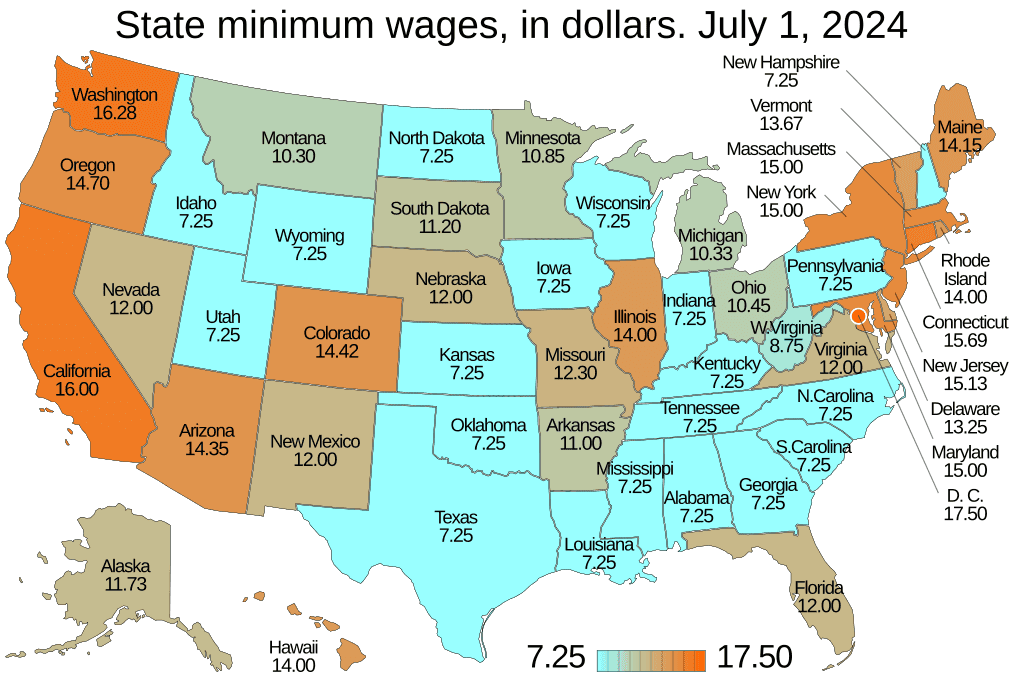
Economic Data
Choropleth maps are also used to visualize economic data, such as income levels, unemployment rates, and economic output.
Maps showing income levels use color gradients to indicate areas with high and low average incomes, helping to identify economic disparities within regions. Unemployment rate maps highlight regions with varying employment challenges, aiding policymakers in targeting interventions. Maps depicting economic output illustrate the productivity of different areas, providing insights into economic strengths and weaknesses across regions.
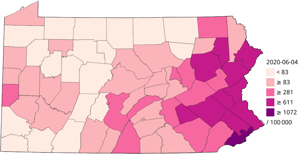
Public Health Data
Choropleth maps are invaluable for visualizing public health data, such as the spread of diseases, vaccination rates, and access to healthcare.
Maps showing disease spread can highlight regions with high infection rates, helping health authorities allocate resources and implement targeted interventions. Vaccination rate maps illustrate areas with varying levels of immunization, identifying regions at risk for outbreaks. Maps depicting access to healthcare reveal disparities in healthcare availability, guiding efforts to improve services in underserved areas.
Environmental Data
Choropleth maps are powerful tools for visualizing environmental data, such as pollution levels, climate data, and the distribution of natural resources.
Maps showing pollution levels can highlight areas with high air or water pollution, aiding in environmental regulation and public health initiatives. Climate data maps illustrate variations in temperature, precipitation, and other climate factors across regions, helping in climate research and policy-making. Maps depicting the distribution of natural resources reveal where resources like minerals, forests, and water are located, guiding sustainable management and conservation efforts.
Political Data
Choropleth maps are often used to visualize political data, such as election results and voting patterns.
Maps showing election results can illustrate which regions supported different candidates or parties, providing insights into political trends and divisions. Voting pattern maps highlight areas with varying voter turnout and preferences, aiding in understanding the political landscape and planning future campaigns.
Creating Choropleth Maps
Creating choropleth maps involves several essential steps to visualize data effectively across geographic regions. Here's a general overview of the process:
-
Define Regions: Identify the geographic regions you want to represent on your map, such as countries, states, counties, or districts. These regions will form the basis of your choropleth map.
-
Collect Data: Gather the data you want to visualize. This data should correspond to the regions you’ve defined and can include variables such as population density, income levels, unemployment rates, or any other measurable attribute.
-
Map Data to Regions: Ensure your data is accurately matched to the corresponding geographic regions. This step often involves formatting your data so that each region's name or identifier in your dataset matches the names or identifiers used in the map.
-
Define Legend and Palette Colors: Choose a color palette that will represent the data values on your map. The legend should clearly indicate what each color represents, with a gradient or distinct colors showing different ranges or categories of your data.
By following these steps, you can create a choropleth map that effectively communicates the spatial distribution of your data, making it easier to identify patterns and trends across different regions.
Creating Simple Choropleth Maps
Creating simple choropleth maps has become more accessible thanks to various online map generators that require no coding skills. These tools make it easy to visualize geographic data with just a few clicks. One popular tool for this purpose is Datawrapper.
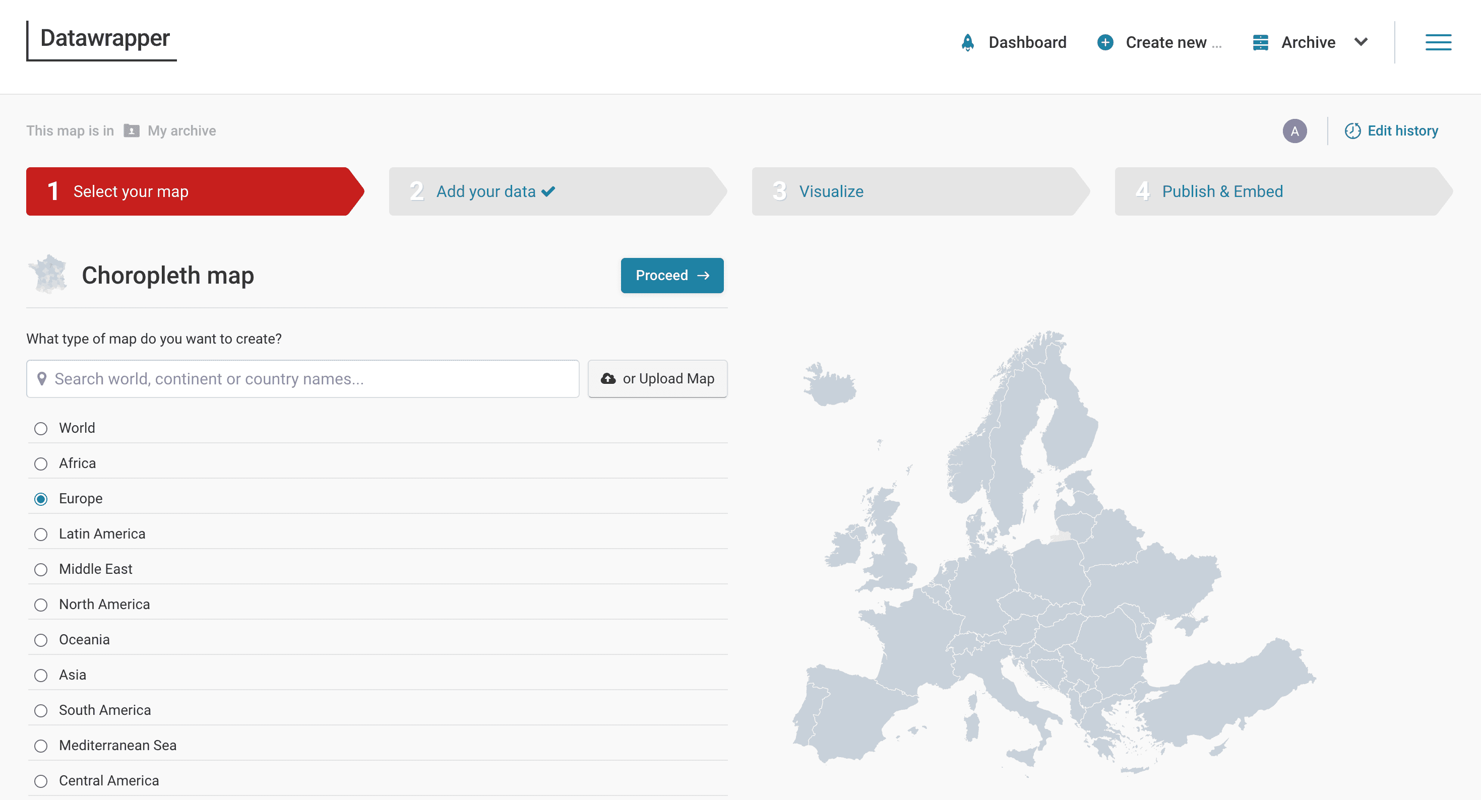
Datawrapper offers a straightforward process to create choropleth maps. Here’s how you can do it:
-
Choose Regions: After signing up or logging into Datawrapper, select the "Choropleth Map" option from the available map types. You’ll need to choose the geographic regions you want to map, such as countries, states, or districts.
-
Upload Data: Prepare your dataset, ensuring it includes the regions and the data values you want to visualize. The dataset should be in a format where each row corresponds to a region, and columns include the region identifiers and data values. Upload this data to Datawrapper.
-
Map Data to Regions: Datawrapper will guide you through the process of matching your data to the map’s regions. Ensure that the region identifiers in your dataset correspond correctly to those on the map.
-
Define Visualization: Customize how your data will be visualized. Choose a color palette and set up the legend to represent different data ranges or categories. You can adjust the colors to make your map more intuitive and visually appealing.
-
Publish or Download: Once you’re satisfied with your map, you can publish it directly through Datawrapper, share it via a link, or embed it on your website. You can also download the map for offline use or further customization.
By using tools like Datawrapper, creating choropleth maps becomes a quick and hassle-free process, enabling anyone to visualize geographic data effectively without needing advanced technical skills.
Creating Advanced Choropleth Maps
For more complex and customizable choropleth maps, you can develop one using JavaScript. This approach offers greater flexibility and allows you to tailor the map to your specific needs. Below, we provide a JSFiddle code sample demonstrating how to create a choropleth map.
In this example, we use boundary data from Geoapify's Boundary and Geocoding API in GeoJSON format. We utilize the Leaflet library to visualize the GeoJSON data and create an HTML palette element for the color legend.
Step-by-Step Guide to Creating a Custom Choropleth Map with JavaScript
- Get Boundary Data: Use Geoapify's Boundary API to obtain geographic boundaries in GeoJSON format. This data includes the geographic regions you want to visualize.
- Add the Data: Format your dataset to include the regions and the associated data values you want to display on the map.
- Visualize with Leaflet: Use the Leaflet library to load and display the GeoJSON data on a map. Leaflet is a popular open-source JavaScript library for interactive maps.
- Create a Color Palette: Define a color palette for your choropleth map, creating an HTML element to serve as the legend that explains what the colors represent.
Here's the JSFiddle code sample that shows how to create a choropleth map:
You can find this example live on JSFiddle to see how it works in practice. By using JavaScript and Geoapify's APIs, you can create highly customizable and interactive choropleth maps tailored to your specific requirements.
Conclusion
Choropleth maps are essential for visualizing data across geographic regions, offering clear and intuitive insights into complex datasets. For quick and easy map creation, platforms like Datawrapper provide user-friendly interfaces that require no coding skills.
For more complex and customizable maps, using JavaScript along with Geoapify Maps API offers greater flexibility. By mastering these tools and techniques, you can create effective choropleth maps to reveal patterns and aid in decision-making.
FAQ
What is a choropleth map?
A choropleth map is a type of thematic map where areas are shaded or colored in proportion to the value of a specific variable, such as population density, income levels, or election results. These maps help visualize data distribution across geographic regions.
What is the definition of a choropleth map?
The definition of a choropleth map involves using different shades or colors to represent data values across geographic areas. Each region on the map is colored based on the data it represents, making it easy to identify patterns and trends.
How does a choropleth map help in visualizing data?
A choropleth map helps in visualizing data by providing a clear and intuitive way to compare values across different geographic regions. By using color gradients, these maps highlight variations and make it easier to see where values are higher or lower.
What are some examples of choropleth maps?
Examples of choropleth maps include maps showing population density, income levels, election results, unemployment rates, and disease spread. These maps can be used in various fields such as demographics, economics, public health, and environmental studies.
How can I create a simple choropleth map?
You can create a simple choropleth map using tools like Datawrapper. These tools allow you to select regions, upload your data, map the data to the regions, define visualization options, and publish or download your map with ease.
What is the meaning of a choropleth map?
The meaning of a choropleth map lies in its ability to visually represent data variations across different geographic regions using color gradients. This method helps convey complex data in an easily understandable format.
Can I create custom choropleth maps with JavaScript?
Yes, you can create custom choropleth maps with JavaScript. By leveraging Geoapify's Boundary API and Geocoding API, along with the Leaflet library, you can develop highly customizable and interactive maps tailored to your specific needs. For an example of how to create a choropleth map using JavaScript, check out this JSFiddle example.
What data types can be represented using choropleth maps?
Choropleth maps can represent various data types, including demographic data (population density, age distribution, ethnic composition), economic data (income levels, unemployment rates, economic output), public health data (disease spread, vaccination rates, access to healthcare), and environmental data (pollution levels, climate data, distribution of natural resources).
How do I ensure accurate data representation on a choropleth map?
To ensure accurate data representation on a choropleth map, it is crucial to correctly match your data to the geographic regions and choose an appropriate color palette. Verifying your data and using reliable sources for geographic boundaries, such as Geoapify's APIs, can also enhance accuracy.